Soylent Packaging
Client
Soylent
Services
Packaging Branding Art Direction
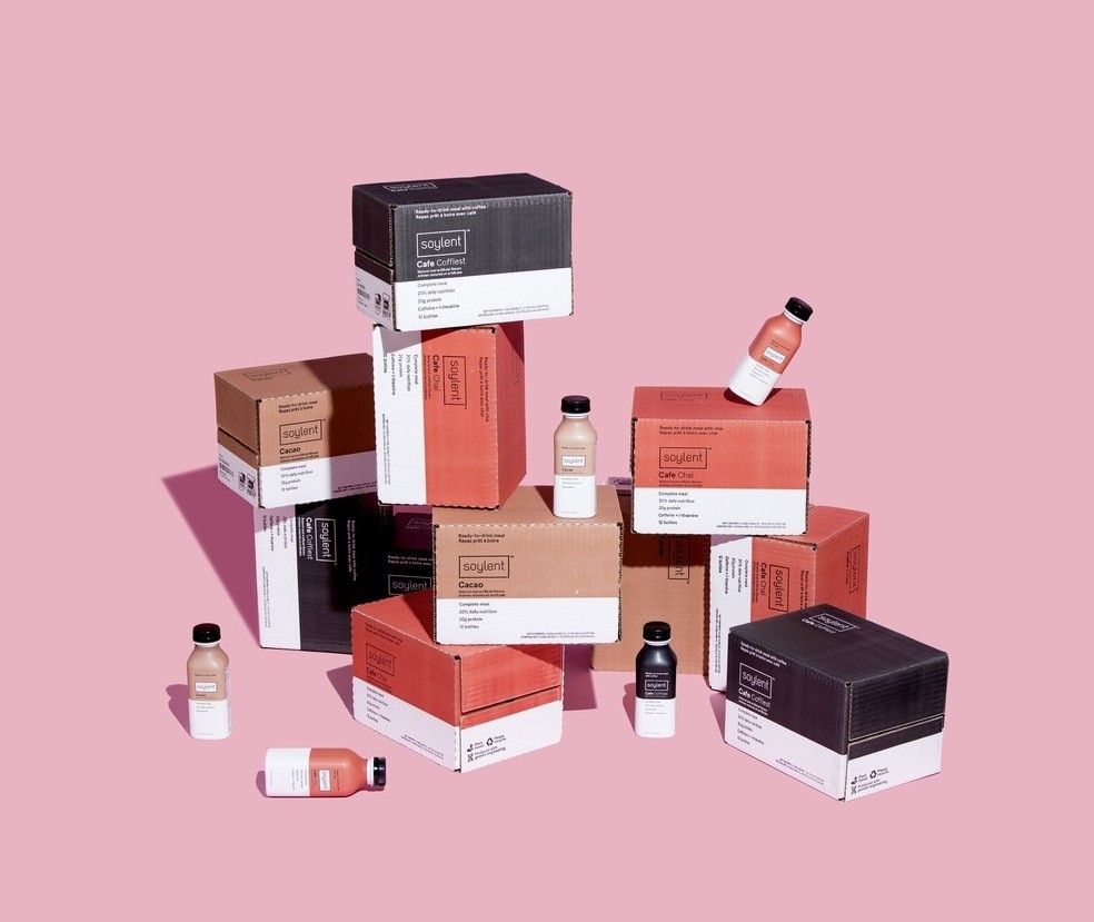
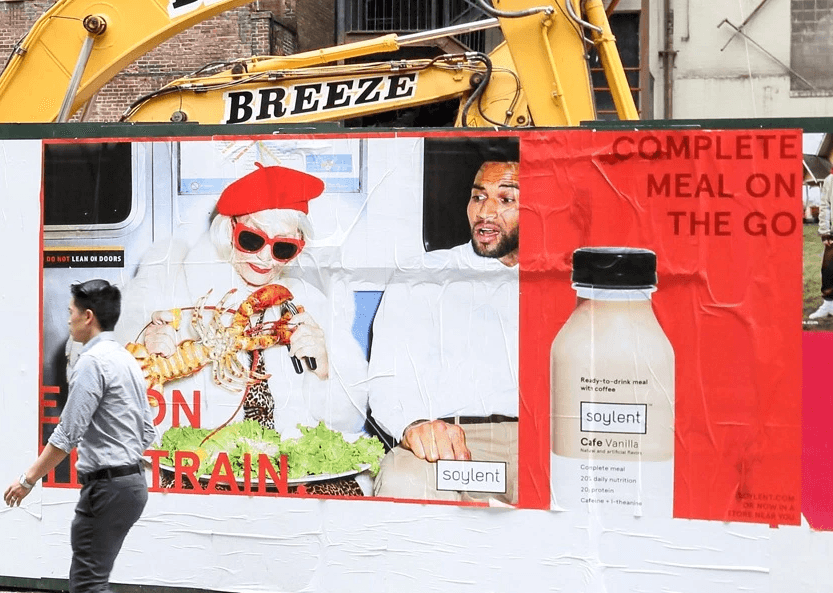
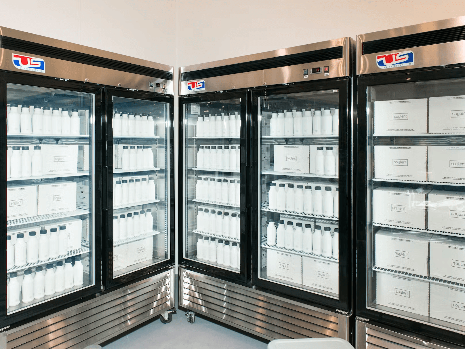
As an early employee at Soylent, one of my first tasks was to develop a way to move from our first (and only) SKU – powder pouches – to our soon to be iconic ready-to-drink bottle. The initial brand was designed to be intentionally stark, minimal, and clinical, but it was not flexible enough to expand into new areas or flavors. So the challenge became how to maintain the essence of the brand that had been so powerful and successful, while expanding into necessary new territories. We first added a caffeinated coffee flavor, which then expanded to several more flavors, some caffeinated and some not. Eventually, the product line outgrew the one-at-a-time way were designing the packaging so we took a step back and overhauled the whole line – including the bottle. This is the result of that work.
The system we developed was scalable beyond the custom bottle, which became crucial as we continued to add new SKUs and product formats.
Creative Direction – Julio Miles
Photography – Beau Roulette
