Blok Biltong
Client
Blok Biltong
Services
Branding Packaging
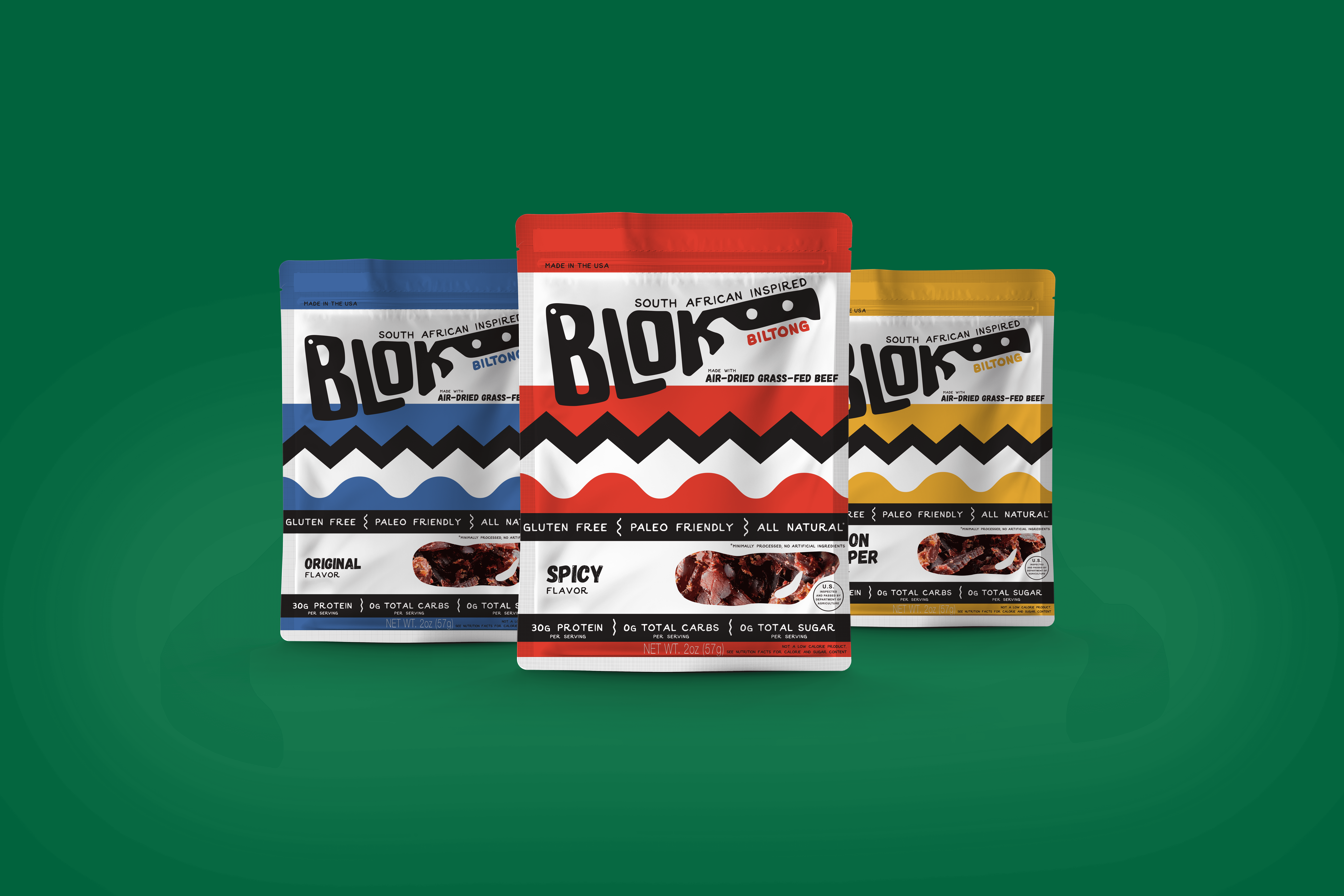
The original brand and packaging featured work from an artist that hailed from biltong's home: South Africa. A nice idea, it looked more like something you'd find in an 80s waiting room than an exotic cured meat snack. We kept the nod to biltong’s South African origins – using colors from the South African flag and designs that felt more handcrafted, but still fresh. A logo rework completed the feel, referencing a big knife traditionally used to carve biltong right off the blo(c)k.
