HMBradley Brand Evolution
Client
HMBradley
Services
Creative Direction Art Direction Graphic Design
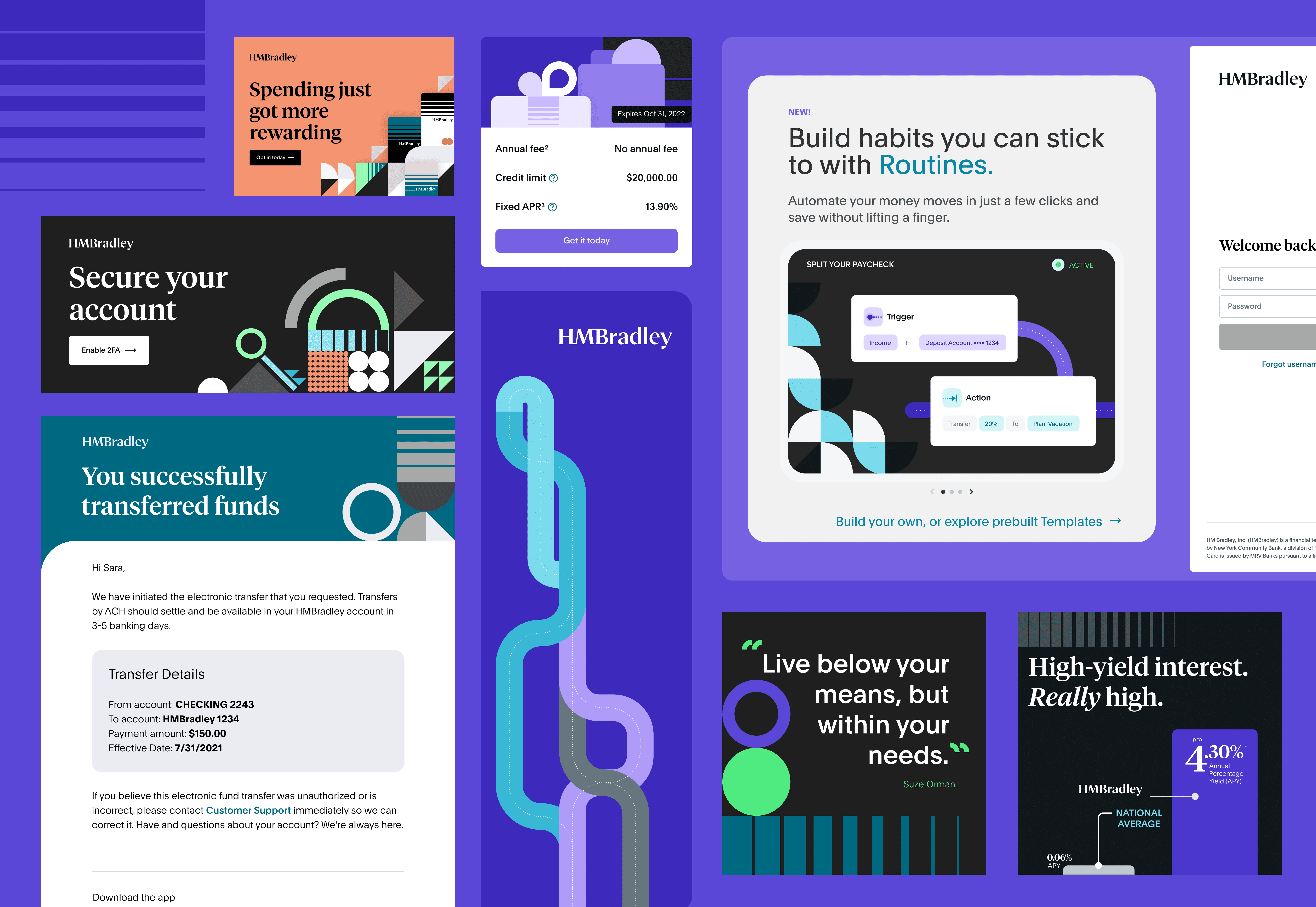
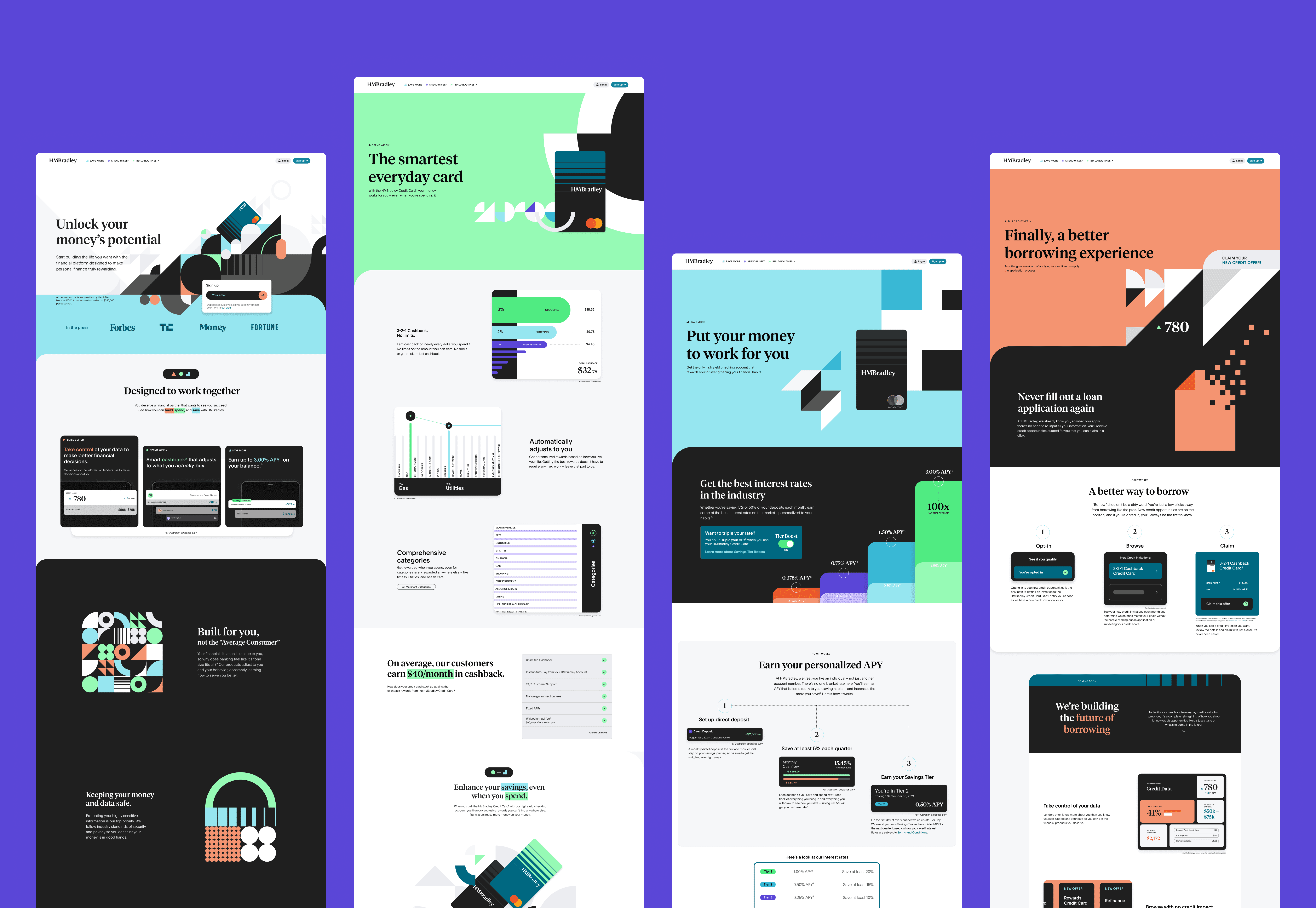
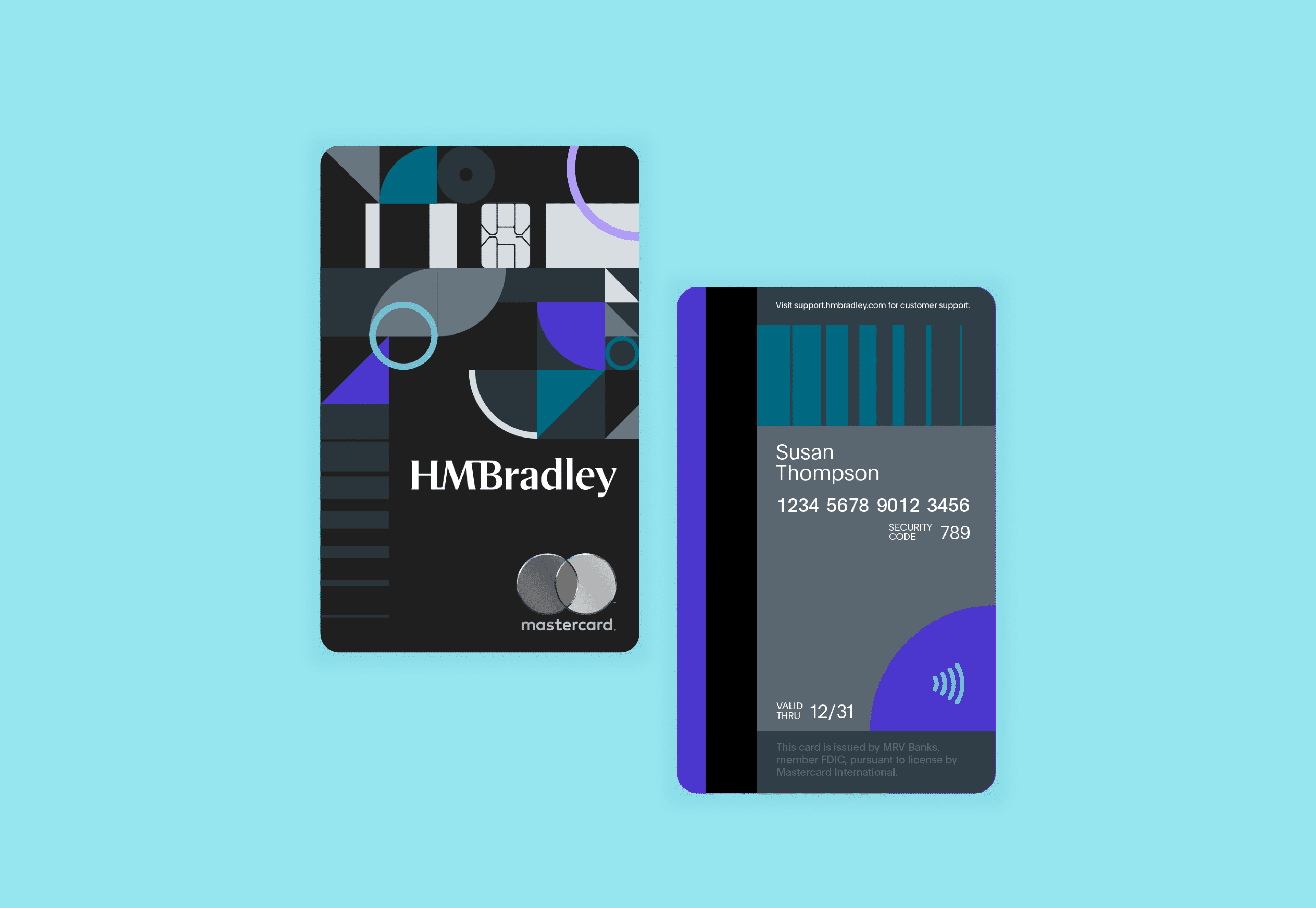
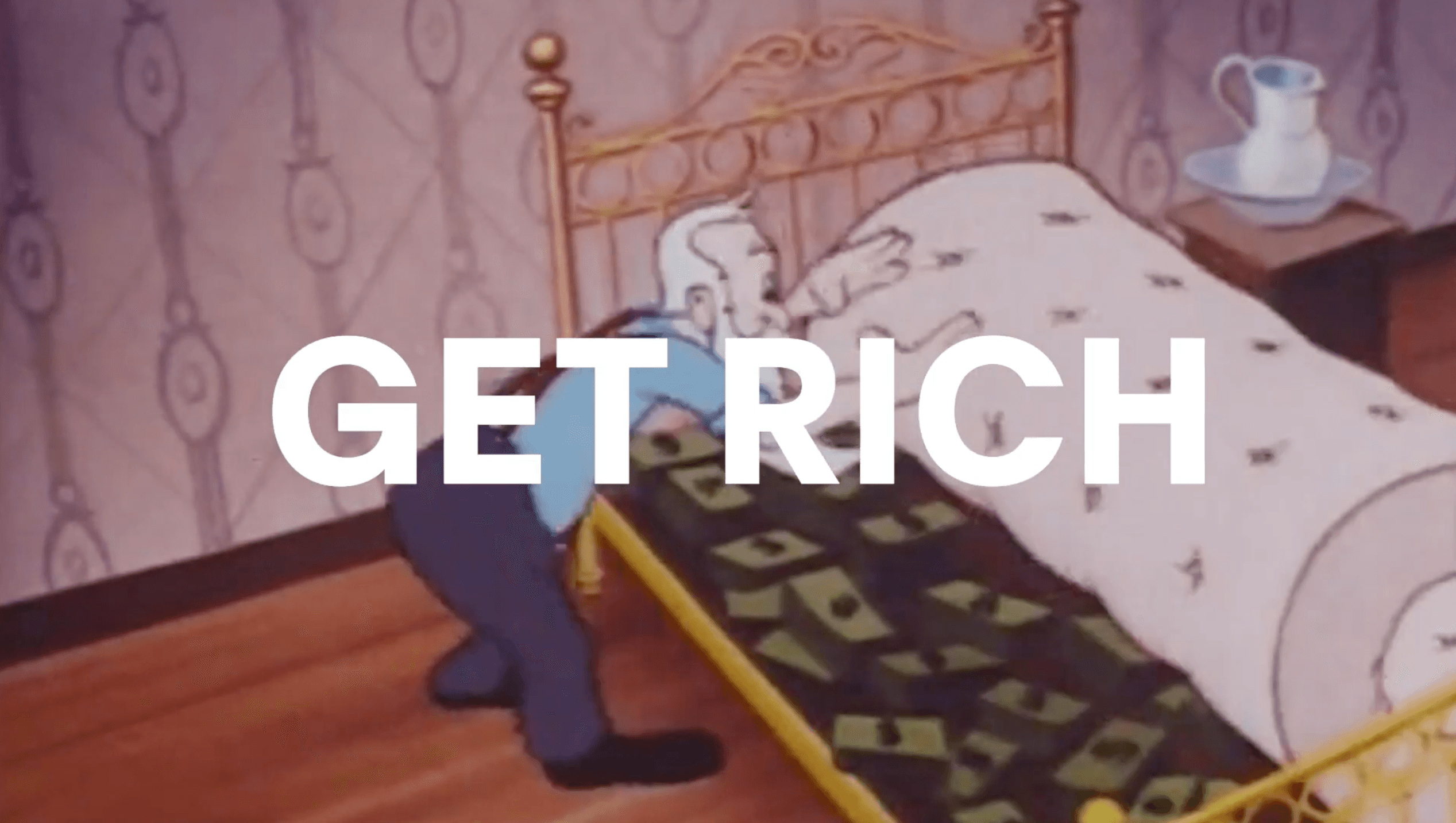
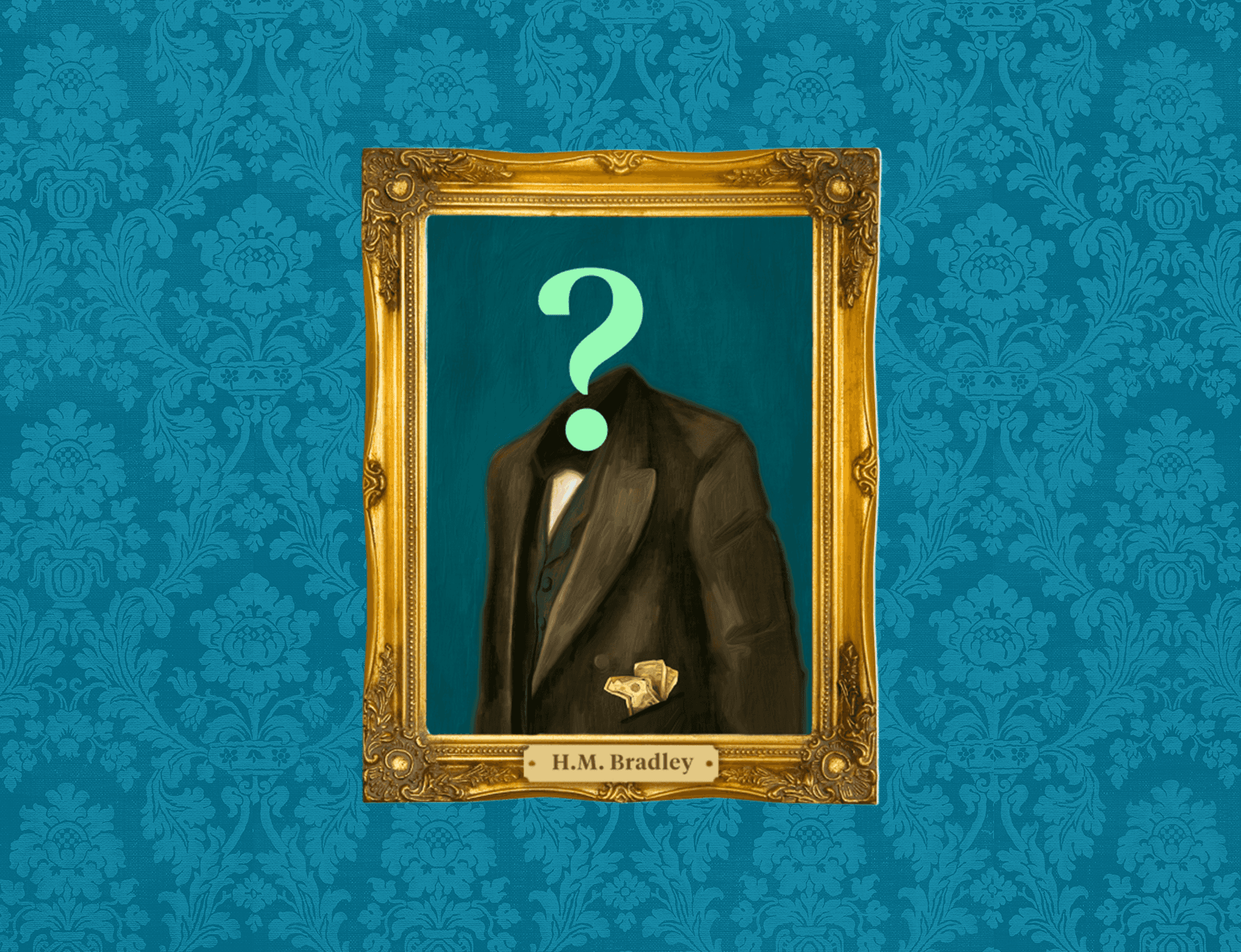
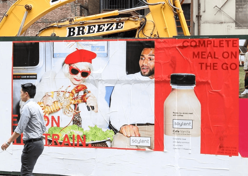
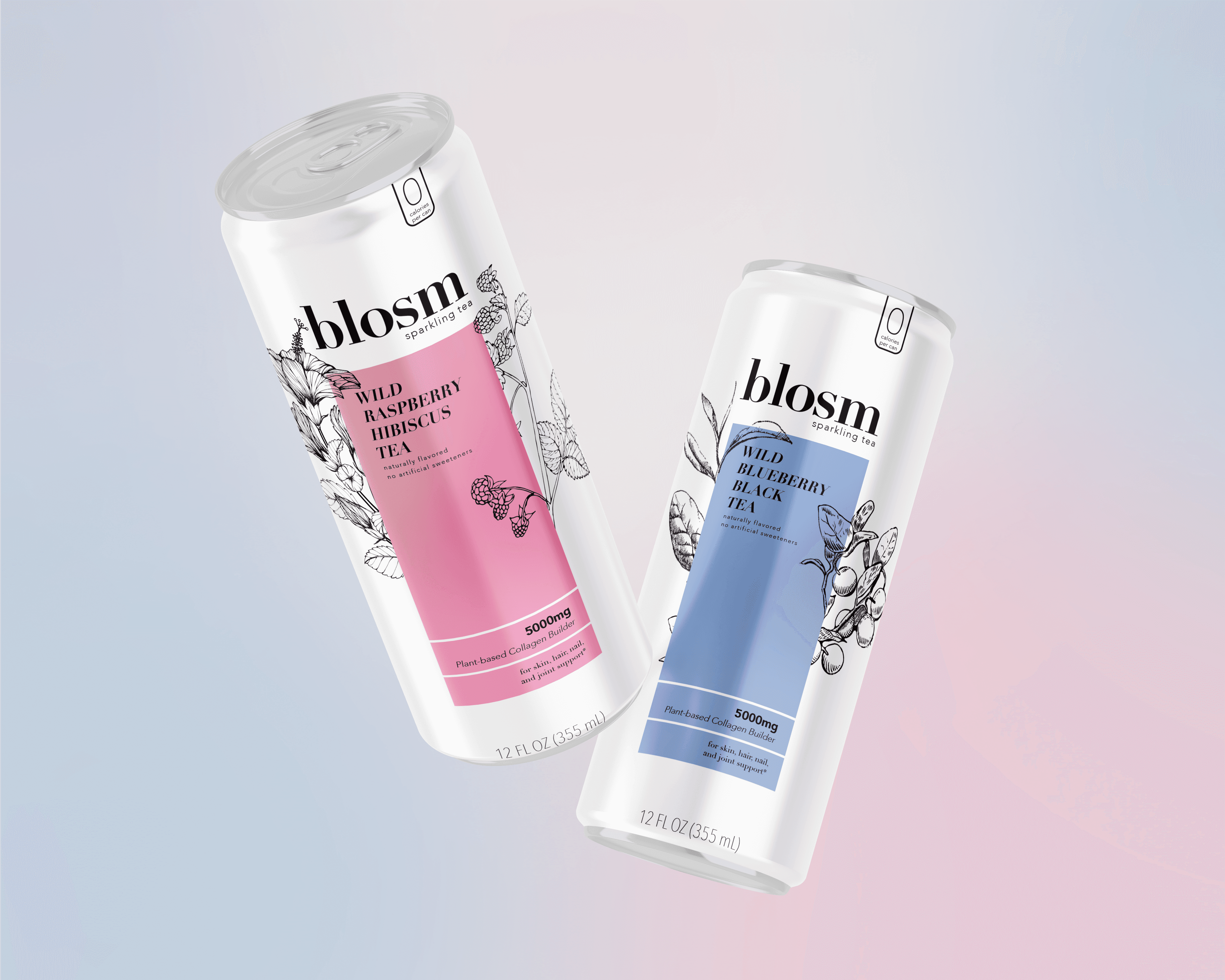
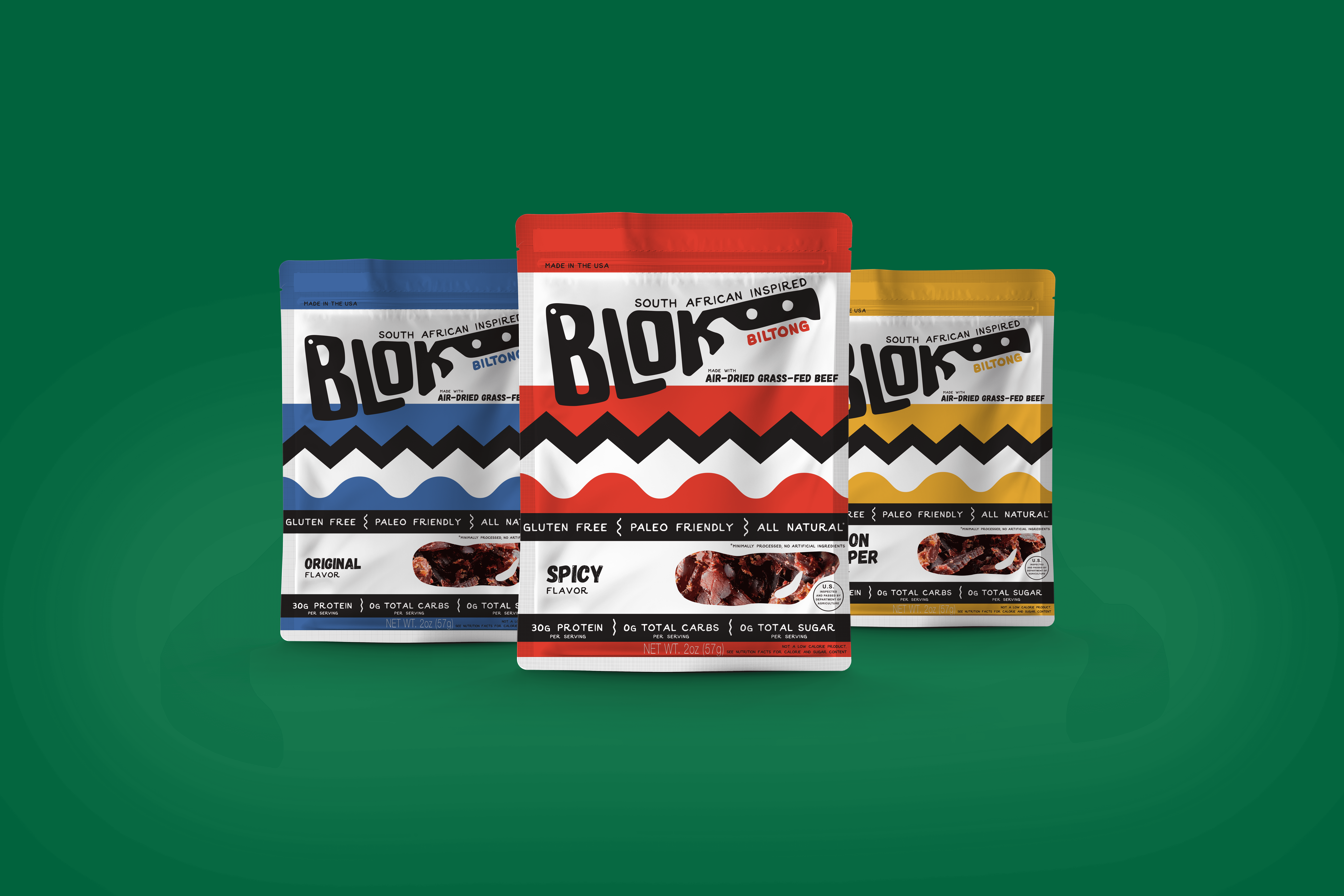
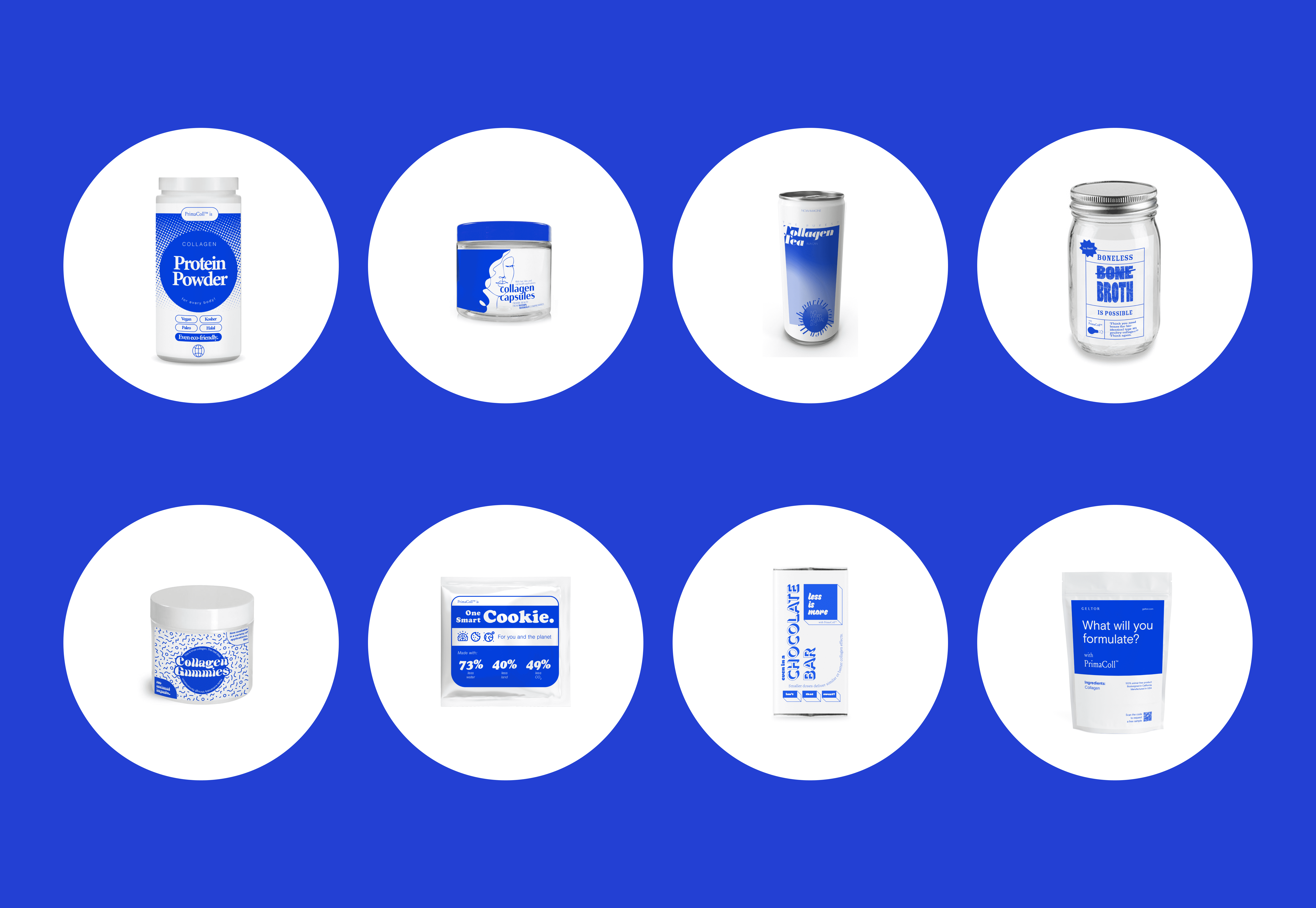
The initial brand we devloped for HMBradley nailed the tone we were looking for. It was grown up without being stuffy. It was trustworthy without being boring. It was fun without being zany. Pentagram designed the logo, developed a font system, and provided a beautiful color palette for us to start with. And in the early days, this was enough. Our product was simple and our needs were limited. But as is always the case, this wasn't the case for long. We soon had needs for illustration, sub-product branding, social media assets, and more. We were developing new product lines that needed further differentiation than the initial brand had baked in. So I developed a system to expand the brand language to include shapes that could be rearranged, layered, and duplicated to create a much larger brand tapestry.
Part of the goal of this expansion was knowing that we had a small team and I couldn't create every asset we needed myself. We also didn't have the budget to pay someone for bespoke illustrations every time we wanted to post on instagram. It was therefore a success that the best work done with this system was not done by me, but rather the team of designers, developers, and agency partners we worked with. Much of the work featured here was done by others (credited below) but it all grew from the direction I set in place. See more at hmbradley.com
Initial Brand – Pentagram
Designers – J Scott Smith, Michele Shi, Shan Wei
